Current Atlanta Traffic Map: How to Check Live Conditions and Avoid Gridlock
Navigating Atlanta means dealing with I‑285, I‑75, I‑85, GA‑400, and the Connector on a regular basis. If you’re searching for a current Atlanta traffic map, you probably want one thing: to see what’s happening on the roads right now so you can pick the best route.
Below is a clear guide to understanding Atlanta traffic patterns, what a live traffic map will (and will not) show you, and how to use it strategically whether you live here, commute in, or are just visiting.
What a “Current Atlanta Traffic Map” Really Shows
Any real-time Atlanta traffic map typically includes:
- Color‑coded congestion
- Green: free-flowing
- Yellow/orange: slow or heavy
- Red/dark red: stop‑and‑go or severe delays
- Live incidents
- Crashes
- Stalled vehicles
- Road debris or police activity
- Construction and lane closures
- Overnight work on I‑285
- Long‑term lane shifts around major interchanges
- Travel time estimates
- For example: “Downtown to Sandy Springs via GA‑400: 18 minutes”
- Optional layers
- Traffic cameras (where available)
- HOV/HOT lane information
- Weather overlay (rain, storms)
A live traffic map updates frequently, but there is always a slight delay. In fast‑changing situations—like a crash just reported on the Downtown Connector (I‑75/85)—conditions can worsen or clear before every app or site catches up.
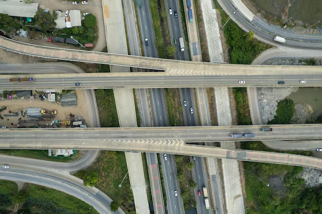
Key Atlanta Highways and What to Watch on the Map
When you pull up a current Atlanta traffic map, you’ll see a web of major roads. Understanding them makes the map much more useful.
I‑285 (The Perimeter)
I‑285 is the loop around Atlanta and a major freight and commuter route.
Common hot spots on the map:
- Top End (North I‑285 between I‑75 and I‑85)
- Heavy during both morning and evening rush hours
- I‑285 at I‑75 (Cobb Cloverleaf in Smyrna)
- I‑285 at GA‑400 (Sandy Springs)
- I‑285 on the west side near I‑20 (truck traffic and interchange backups)
On a traffic map, don’t be surprised if north and west I‑285 are red or orange for long stretches at peak times.
Downtown Connector (I‑75/85 Through Downtown)
The Downtown Connector is the stretch where I‑75 and I‑85 combine and cut through central Atlanta.
Expect:
- Frequent slowdowns near:
- Midtown (around 14th–17th Street)
- Downtown (around I‑20 interchange, Mercedes‑Benz Stadium, State Farm Arena)
- Sudden stops from:
- Merging traffic
- Lane changes near exits like Courtland St., Spring St., and Williams St.
On live maps, the Connector is often one of the first places to turn red when anything goes wrong.
I‑75, I‑85, and GA‑400 Radiating Out of the City
These are key commuter routes visible on every Atlanta traffic map:
- I‑75 North (to Cobb County, Kennesaw, Acworth)
- Heavy near Cumberland/Vinings, Barrett Parkway, and Wade Green Road
- I‑85 North (to Buckhead, Doraville, Gwinnett County)
- Congestion around Brookwood split, GA‑400, Spaghetti Junction (I‑285), and north through Norcross and Duluth
- GA‑400 (Downtown/Midtown to Sandy Springs, Roswell, Alpharetta)
- Rush‑hour delays near Glenridge Connector, I‑285, Abernathy Road, and major business exits like Holcomb Bridge and Windward Parkway
- I‑20 East/West (to Decatur, Lithonia, Douglasville)
- Watch around Downtown interchange, Moreland Avenue, Panola Road, and Six Flags area
If your route includes any of these, a quick check of the current traffic map before you leave can save you from sitting through long backups.
Typical Atlanta Traffic Patterns to Expect on the Map
Even without an incident, traffic in Atlanta is highly time‑dependent. When you open a live map, the patterns you see usually follow this rhythm:
Weekday Rush Hours
- Morning: Roughly 6:30 a.m. – 9:30 a.m.
- Inbound traffic toward:
- Downtown and Midtown
- Buckhead and Perimeter Center (GA‑400, I‑285 north)
- On the map, expect:
- Red/orange on I‑75 south, I‑85 south, GA‑400 south, and along I‑285 top‑end
- Inbound traffic toward:
- Afternoon/Evening: Roughly 3:30 p.m. – 7:00 p.m.
- Outbound traffic from the city core
- Longer delays on:
- I‑75 north and south
- I‑85 north and south
- I‑20 east and west
- I‑285 in multiple directions
Weekends and Event Traffic
On weekends, congestion is more event‑driven:
- Sporting events and concerts:
- Mercedes‑Benz Stadium (Downtown)
- State Farm Arena (Downtown)
- Truist Park / The Battery Atlanta (Cobb County, near I‑75 and I‑285)
- Major festivals and conventions:
- Georgia World Congress Center
- Midtown, Old Fourth Ward, and Downtown streets
During these times, a current trafic map often shows heavy red around specific exits and surface streets, even if the highways are flowing more normally.
Weather and Incident Impacts
Rain, storms, or even the threat of severe weather can cause:
- Slower average speeds across:
- I‑75/85
- GA‑400
- I‑285
- More crashes and disabled vehicles, clearly marked as incident icons on the map
- Longer backups at known bottlenecks
If storms are moving in, check the map more frequently—conditions often change quickly.
How to Read and Use a Current Atlanta Traffic Map Effectively
Once you’ve opened a live map, these steps can help you use it like a local:
1. Zoom Out First
Start by zooming out far enough to see:
- All of I‑285
- Main spokes: I‑75, I‑85, GA‑400, I‑20
This shows overall traffic health—whether the entire region is bogged down or just one corridor.
2. Look for Key Chokepoints
On the map, pay special attention to:
- Interchanges:
- I‑75/I‑285 (Cobb Cloverleaf)
- I‑85/I‑285 (Spaghetti Junction)
- I‑20/I‑285 (east and west sides)
- GA‑400/I‑285
- Bridges and lane drops:
- Areas where lanes reduce or merge quickly
If those are bright red, consider alternate routes.
3. Compare Main Route vs. Alternatives
For many common trips in Atlanta, you have choices:
- Downtown to Perimeter Center (Sandy Springs)
- Option A: I‑75/85 → GA‑400
- Option B: I‑75 → I‑285 east → GA‑400
- Option C: Surface streets such as Peachtree Street, Roswell Road, or Piedmont Road (depending on exact start and end)
Use the map to compare which corridor is:
- Less congested overall
- Showing fewer incident icons
4. Check Incidents, Not Just Colors
Dark red without incident icons sometimes means typical rush‑hour congestion.
Red with multiple crash or hazard symbols can signal unusual, long‑lasting backups.
In Atlanta, even a single left‑lane crash on the Downtown Connector or GA‑400 can add 20+ minutes if it’s not cleared quickly, which you may see reflected in backed‑up red segments.
5. Recheck During the Trip (Safely)
If you’re driving:
- Have a passenger monitor the map
- Or pull over safely to recheck routes
- Many in‑car systems offer voice‑guided, traffic‑aware routing
This matters in Atlanta because conditions change quickly, especially if new crashes occur near bottlenecks.
Major Atlanta Corridors and What to Expect (Quick Reference)
Use this summary to know what to look for when you open a current traffic map.
| Corridor / Area | What You’ll Commonly See on the Map | Typical Trouble Times* |
|---|---|---|
| I‑285 Top End (I‑75 to I‑85) | Heavy congestion, slow merging, red/orange throughout | 7–9:30 a.m., 4–7 p.m. |
| Downtown Connector (I‑75/85) | Stop‑and‑go near Downtown & Midtown exits | Peak rush hours, events |
| I‑75 North (Cumberland → Kennesaw) | Red stretching from I‑285 north, especially near Truist Park on game days | Afternoon/evening, event times |
| I‑85 North (Brookwood → Gwinnett) | Red near GA‑400, Spaghetti Junction, and major suburban exits | Morning into city, evenings out |
| GA‑400 (Midtown → Alpharetta) | Congestion near I‑285 and key office exits | Weekday rush hours |
| I‑20 East/West | Red near Downtown interchange and busy suburban exits | Rush hours, holiday travel |
*Times are approximate and can vary by season, school calendar, and events.
Using Current Traffic Maps for Different Types of Trips
Daily Commuters in Metro Atlanta
If you commute into or across Atlanta:
- Check twice:
- Once before leaving home
- Once before you hit your usual bottleneck (if possible)
- Consider:
- Shifting departure time by 15–30 minutes if your corridor is deep red
- Using HOV or express lanes where available, if you’re eligible and comfortable using them
- Watch:
- Weather overlays and incident icons along your exact route
Over time, you’ll learn which segments on the map almost always jam up and which backups usually clear quickly.
Visitors Driving into the City
If you’re visiting Atlanta:
- Familiarize yourself with:
- The Perimeter (I‑285) as the loop
- The Downtown Connector as the spine through the middle
- Before leaving:
- Look at the whole region on the map, not just your destination
- Around major venues:
- Expect deep red near Mercedes‑Benz Stadium, State Farm Arena, or Truist Park before and after events
- Consider:
- Parking slightly farther out and using MARTA for certain trips—especially Downtown and Midtown during large events
Deliveries, Service Calls, and Rideshare Drivers
If you drive for work in Atlanta:
- Keep a traffic‑aware navigation tool running at all times
- Re‑evaluate after completing each stop:
- Look ahead 10–20 miles on major corridors
- Watch for:
- Construction zones and long‑term lane closures, especially along I‑285 and around key interchanges
Even short surface‑street routes can be affected by freeway incidents as drivers bail off onto parallel roads like Peachtree Road, Roswell Road, Ponce de Leon Avenue, or Moreland Avenue.
Local Agencies and Resources Connected to Atlanta Traffic
While your live traffic map will usually come from a navigation or mapping service, several official Atlanta‑area agencies influence traffic information and road conditions:
- Georgia Department of Transportation (GDOT)
- Oversees state routes and interstates such as I‑75, I‑85, I‑285, I‑20, GA‑400
- Main headquarters:
- 600 West Peachtree Street NW
Atlanta, GA 30308 - Phone (main switchboard): 404‑631‑1990
- 600 West Peachtree Street NW
- City of Atlanta Department of Transportation (ATLDOT)
- Manages city streets, traffic signals, and street improvements within the City of Atlanta
- Main offices are typically in or near City Hall in Downtown Atlanta:
- 55 Trinity Avenue SW
Atlanta, GA 30303 - Main City of Atlanta information line: 404‑330‑6000
- 55 Trinity Avenue SW
- Atlanta-Fulton County Emergency Communication (911)
- For immediate emergencies, crashes with injuries, or dangerous road conditions, dial 911
- For non‑emergency public safety questions in the city, Atlanta Police non‑emergency line: 404‑658‑6666
These agencies don’t usually provide a consumer‑facing “live traffic map” with turn‑by‑turn directions, but they are responsible for signal timing, lane closures, incident response coordination, and roadway repairs that heavily influence what you see on any current Atlanta traffic map.
Practical Tips for Using a Current Atlanta Traffic Map Day to Day
To make the most of any live Atlanta traffic map:
- Check before you commit
- Look up your route before entering major ramps like onto I‑285 or GA‑400.
- Plan around known choke times
- If possible, avoid starting long cross‑town drives exactly at the heart of rush hour.
- Consider alternate corridors
- Depending on your origin and destination, surface streets such as Cheshire Bridge Road, Buford Highway, Northside Drive, or Memorial Drive may be faster if the highways are deep red.
- Watch for event schedules
- On nights with big games or concerts, expect heavy red zones around venues and plan extra time.
- Adjust for weather
- In rain or storms, treat all travel time estimates as optimistic and allow a buffer.
Used this way, a current Atlanta traffic map becomes more than just a snapshot of congestion—it’s a planning tool that helps you choose the best route, right timing, and backup options for moving around metro Atlanta with fewer surprises.